 Flash
Flash 
Statistics and the voice timeline
Reachable from the home screen by swiping left, or from the child’s card. Four periods: 1 month, 3 months, 6 months, 1 year.
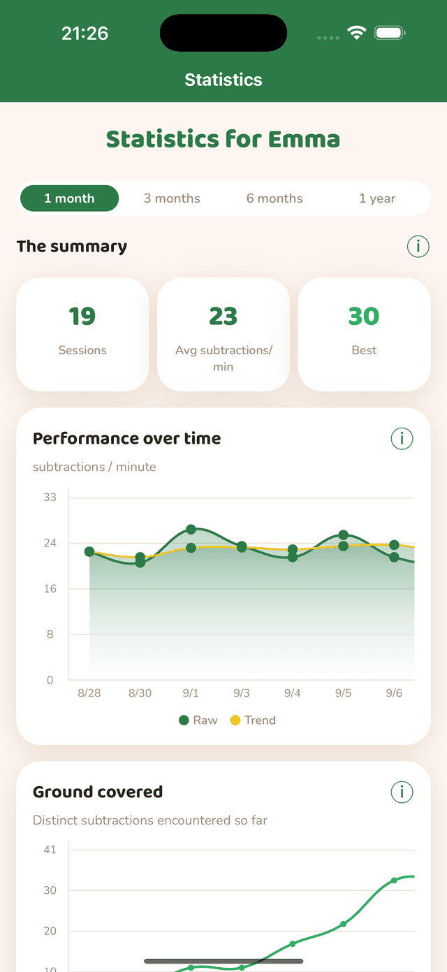
Performance over time
The blue curve gives the measured speed, the orange one the smoothed trend. Read the trend: a single session is noisy because of tiredness or a harder step. Each point is a day — the average of that day’s sessions — and a week on long periods.
Voice metrics
- Reaction — average delay between the card appearing and speech starting. It is the most reliable sign of an automatism settling in: it shortens week after week.
- Pronunciation — average duration of the answer itself.
- Errors — average number of failed attempts per item before the correct answer.
Tapping a bar of the timeline
In a session’s detail, the timeline bars shrink when an answer includes errors and no longer have room to show their times. Tap any bar to open the detail of that attempt: reaction, pronunciation, detection delay — and, for an error (red bar), what the speech recognition heard instead of the expected answer. It is the most direct tool to spot a recurring confusion.
Feeling and recent sessions
The evolution of the feelings given at the end of sessions, to be read against the performance curve. Below, the list of recent sessions: tap a line to reopen its full detail, timelines included.